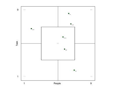
One answer is the Team Member Profile Test. It's a set of questions which team members answer. They are evaluated to give a result indicating which type of team member the person is and where it lies in the spectrum of possible types.
There are two dimension which are considered there, how much team members are oriented towards tasks and how much they are oriented towards people. This can be visualized in a Results Chart.
Here is an example:
You can see five segments:
- The center (5,5) is the "worker" who has a set of balanced of attributes, no extremes. These team members are extremely important because they tend to just get stuff done.
- The top left (9,1) is the "expert" who is focused on the task and its details but doesn't consider people that much. You need these to get the depth of work which is necessary to create great results.
- The bottom right (1,9) is the "facilitator" who is something like the soul of the team, focused on social interactions and supports the team in creating great results.
- The top right (9,9) is the "leader" who is strong on task and people and is giving direction to the team. You need these but you don't want to have more than one or two in a team otherwise there are conflicts of leadership.
- The bottom left (1,1) is the "submarine" who floats along and tries to stay invisible. Not strong on any account. You don't want these in your team.
The test can provide some insight into the balance of the team. You want to have all but the submarine covered with an emphasis on the workers.
How does your team look like on this diagram?

May be I'm missing something but which category scores correspond to the People and Task axes?
ReplyDeleteThere is no direct correspondence to the axis in the scores. The scores give an indication of how strong the types are in a person. Then you choose the position roughly based on the qualitative results. So for example a person with the same value in 9.9 and 9.1 would be on the middle line. A person who is a lot of 9.9 and few of 9.1 would be at the top. And the points in the diagram should be arranged relative to each other so that they reflect the strength of the different scores. It's quite natural if you have a set of real values.
DeleteThanks, I understand it now. Does it make sense to take into account the second highest type, would it reflect the person better?
Delete